Blog

You are filtering on tag 'tutorial'. Remove Filters
RSS

Sizing elements to fit their contents in Unity UI

April 10th, 2019 (edited November 3rd, 2022)

You have a UI widget that contains a number of different elements (text, images, etc). These are all children of a background element, which you want to automatically resize to encompass all of these children.

You read a bunch of forum threads and the documentation and it just won't work. Me too. I figured it out, though, so I'm documenting it here. This was written with reference to Unity 2018.3.3.

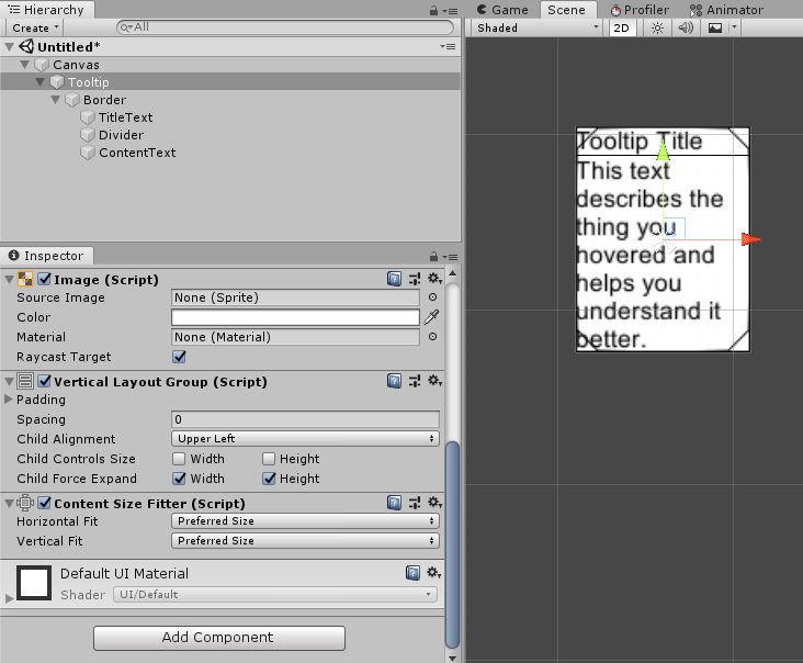
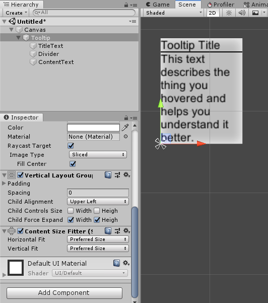
To demonstrate, I'll be creating a tooltip. I'm starting with a naive implementation - a few different widgets that are children of a VerticalLayoutGroup.

The results of the naive implemention. There are large gaps between the different elements and the background is the wrong size.

The first important concept to understand is the idea of "preferred" size. Preferred size is an internal value that some UI components have (specifically, ones that implement the ILayoutElement interface). It doesn't have anything to do with any of the values of the RectTransform on that element. Some examples of components that have a preferred size:

  • Image - The preferred size is the original size of the sprite being used.
  • Text - The preferred size is the size of the actual visible text.
  • Layout Groups - The preferred size is the size of the bounds encompassing all of the group's children.
  • Layout Element - Allows you manually set the preferred size for an object.

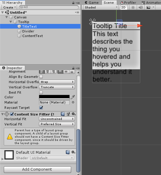
By default, Layout Groups look at the RectTransform size of their children when deciding how to position them, not the preferred size1. Remember that for Text components, the visual size of the rendered text is the preferred size, not the RectTransform size. So in order to include Text in a Layout Group and have it respond to the actual rendered text, we need to set the text's RectTransform size to match its preferred size.

There is a built-in component for this called ContentSizeFitter. When attached to a GameObject with a UI component on it, it can set the RectTransform size of that object to match the preferred size.

I'll attached ContentSizeFitters to each of the Text objects and set the Vertical Fit to "Preferred Size". You may have to disable and re-enable the VerticalLayoutGroup to get it to refresh. You'll also see a warning message on the ContentSizeFitter component about the parent layout group, which you can ignore for now (but see footnote 1).

The results of the second attempt. The contents are correctly positioned but the background is still the wrong size.

This is getting closer, but the background (an Image component on the Tooltip object) isn't resizing yet. Remember that the preferred size of the VerticalLayoutGroup is the size of the bounds encompassing all its children. So let's just add a ContentSizeFitter to the VerticalLayoutGroup object and set both fits to "Preferred Size".

The results of the third attempt. The contents are correctly positioned and the background is the correct size.

And that's pretty much it. You can use the Padding and Spacing properties on the Layout Group to clean it up.

1 Layout Groups have two checkboxes for "Child Controls Size", one for the Width and one for the Height. Checking these boxes causes the Layout Group to automatically perform the function of the ContentSizeFitter - changing the RectTransforms of the children to match their preferred size. This allows you achieve the same result without ContentSizeFitters, and it is apparently how Unity now intends it to be done; however, it affects ALL the children of the layout group. That includes the divider in this case, which we didn't want to resize. We could have fixed this by adding a LayoutElement component to the divider and setting its preferred height to 1.

One more thing

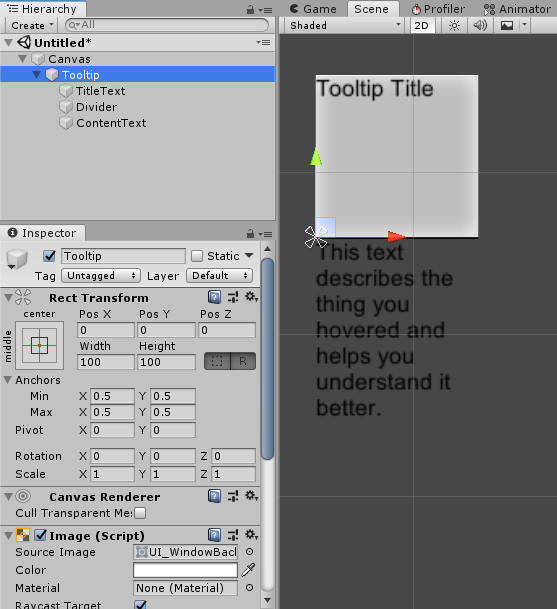
What if I wanted to introduce a second part of the background - a border? Ordinarily, I would make the border a child of the background and set the RectTransform Anchors to stretch both dimensions. But that won't work in this case because the background can no longer find the content items (Layout Groups only operate on their immediate children), so it won't grow to match them.

The results of attempting to add a border. The border is the correct size, but the background is not.

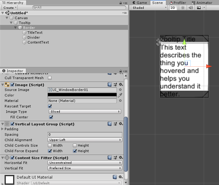
What we really want in this case is to pass the size up from a Layout Group on the border. I move the Layout Group and ContentSizeFitter from the background to the border. Now the border is sizing correctly, but I need to get the background to match it as well.

Remember that Layout Groups set their own preferred size to the size of the bounds encompassing all of the group's children. So we can achieve this by adding a Horizontal or Vertical Layout Group to the background (they will produce the same result with only one child), which sets the preferred size, and then adding a ContentSizeFitter to the background, resizing the RectTransform to match.

A tooltip with a correctly-sized border and background.
Permalink

A Different Approach to Pip-Based Bars

November 23rd, 2017 (edited November 3rd, 2022)

I've been checking out a number of different systems in Factorio while experimenting with making a factory-building game. While looking through the game's assets, I noticed an interesting health bar graphic that revealed Factorio's rather neat way of handling pip-based health bars. A pip-based bar uses filled or unfilled pips to indicate progress or health, rather than a continuous line:

Factorio health bar screenshot

The most obvious way to implement this element would be to use a number of different sprite instances, and have each of them flip between a "green" and a "grey" image as appropriate. This can be done in one draw call, if the two states are on one image, and one quad per pip. Here's the asset you would need to implement this:

Two health bar pips, one green, one grey

So I was initially confused when I saw that Factorio's health bar asset actually looked like this:

Factorio health bar with lots of green pips followed by lots of grey pips

Can you figure out how this asset might be used? My guess is that the bar is drawn as a single quad that's mapped to an appropriate part of this image using its UV coordinates. For example, if you wanted a 7-pip bar with 5 pips filled, you could map your UVs like so:

Factorio health bar asset with UV mapping illustration

This is more efficient because you only have to draw one quad. More significantly, it's simpler to implement because you only need a single sprite or entity in your engine, rather than having to create several and manage their positions. Your asset just needs to have twice as many pips as the maximum pip count you want to use.


Permalink

Persistent data in the Alexa Skills nodejs SDK

February 5th, 2017

I recently started use the Alexa Skills Kit SDK for nodejs to write an Amazon Alexa skill. I ran into one rather silly roadblock, which I will now share so others can avoid.

This SDK handles persisent data (with the same session and across sessions) by providing an attributes property on the skill handler (accessed by this.attributes). My problem was that sometimes properties I set on this object were apparently completely ignored by the next request (even if I kept the session open with an this.emit(":ask", ...) response). It is perhaps obvious in hindsight, but you must make all your changes to this.attributes before calling emit, as emit will immediately and synchronously prepare and send the response to Alexa, including the attributes you're trying to persist into the next session. But it took me quite some time to figure this out.


Permalink

Contact Listeners in box2d.js

April 20th, 2015

To implement physics in Porcupine Dogfight, I used Alon "kripken" Zakai's emscripten port of Box2D to Javascript. It was very easy to get working and almost entirely identical to the original Box2D implementation, however, it lacks documentation for some of the differences. After some experimentation and trying to read the crazy auto-generated source code, I finally figured out how to implement a Contact Listener. There are two things that are not immediately obvious: the listener must be an instance of JSContactListener, and the parameters passed in are not objects, but pseudo-pointers that need to be dereferenced with wrapPointer.

I post some sample code on Github for the benefit of anyone else who has this problem in the future.


Permalink

Magic Mobile Website Compatibility

January 31st, 2015

I recently started working on making these pages more compatible with mobile devices. One piece of advice I found quickly was to include the following meta tag in my HTML header:

<meta name="viewport" content="width=device-width,initial-scale=1">

It took me a bit longer to figure out exactly what this seemingly magic piece of code actually means for a site being rendered in a mobile browser, and to convince myself that yes, this code can magically make your website display much better on small mobile devices - but only if your website's CSS is already set up in a nice, size-independent way.

By default, mobile browsers assume that most of the internet is not designed to display well in a very small format. For that reason, they will render webpages at a large resolution more comparable to a desktop, and force the user to zoom and pan to see the content. What this code is actually doing is informing the browser that, yes, your content is fine to be displayed in a very small window - you are promising that it will resize itself and nothing will bleed off the page. This causes the browser to disable the extra-large render, freeing users from needing to zoom or scroll content sideways. So, if you've set up all your CSS to use percentages instead of fixed positions, it should result in an instant improvement in user experience as users can now simply scroll vertically through your content.

In my case, there was one other change needed to make this site's content mostly mobile-compatible. I often use screenshot images here, and those images are usually wider than a typical phone display, so I need them to scale down if the window is smaller than they are. This was accomplished easily enough by including the following CSS in the HTML header:

<style>img{max-width:100%;}</style>

Which simply instructs every img element on the page to be no wider than its parent element. Aspect ratio is preserved automatically.

There are plenty of other small UX adjustments that can be made, but now my site renders in a much more convenient format for visitors on phones.


Permalink


Previous Page
7 posts — page 1 of 2
Next Page